In the last blog post about the principles in visual design, we talked about the importance of getting the fundamentals right. Assuming you’ve read it and know them front to back, this time, let’s have a look at some trends, particularly in illustration, and see if any suit your business needs.
3D Illustration
Flat design has been the trend for the longest time, but illustrations have started becoming more and more 3D in recent years. We can see this in illustrations of characters, various shapes, or objects. Even though the 3D trend had also been here some time ago, this time around, it took on a different approach – smoothness, and realness.
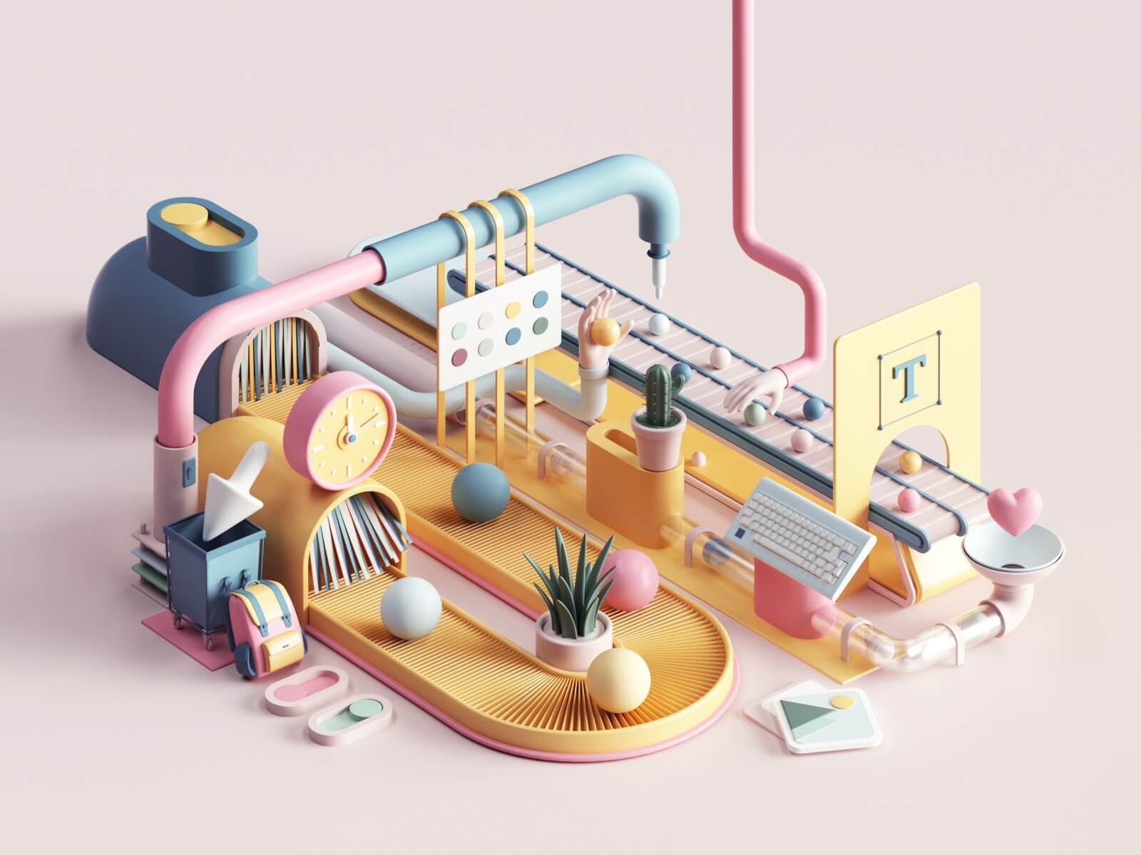
Source: dribbble.com/tarka
3D Characters
This one deserves a separate category as the 3D characters we see in illustration nowadays are super unique. They’ve got the flawless ultra-realistic look, as they call it. It is almost hard to judge whether we’re not looking at a photograph instead of an illustration. This approach has been particularly successful ever since the pandemic had us all switch to digital reality.
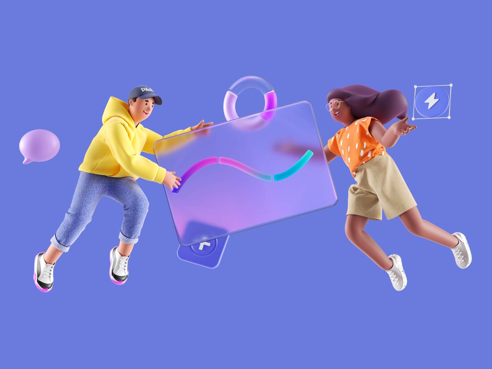
Source: dribbble.com/pitch
Odd Bodies
Typing this trend felt somehow wrong, but we bet you know what we mean by odd bodies in illustration. Weirdly proportionate legs, arms, heads. They. Are. Everywhere. There are surely many interpretations of why this trend has been so popular, one of which is, in our opinion, the matter of self-acceptance and self-love. One of the few disadvantages of being reliant solely on our electronic devices for a human connection is seeing the “perfect“ looking Instagram influencers instead of real people. It is essential to remind ourselves that everybody **is different and that there is no such thing as a beauty standard. On top of that, proportionate bodies are dull.
Flat Characters
Yes, we know we’ve just mentioned 3D characters, and now we’ve listed flat characters as a trend but hear us out! The flat element has not entirely vanished with the 3D comeback. It has just evolved. Flat character design has more or less always been here, but each time with a different approach. This time, it’s the bodies with no patterns. Majority of the time, even without faces! Well, now we have the simple flat characters, odd bodies, and 3D characters. Which one of these you’re going to use will depend on your business needs, of course. The flat geometric characters are more suitable for infographic videos, where the focus is supposed to be on different things that are more important. On the other hand, the 3D character will surely grab your users’ attention and make itself the center of attention.
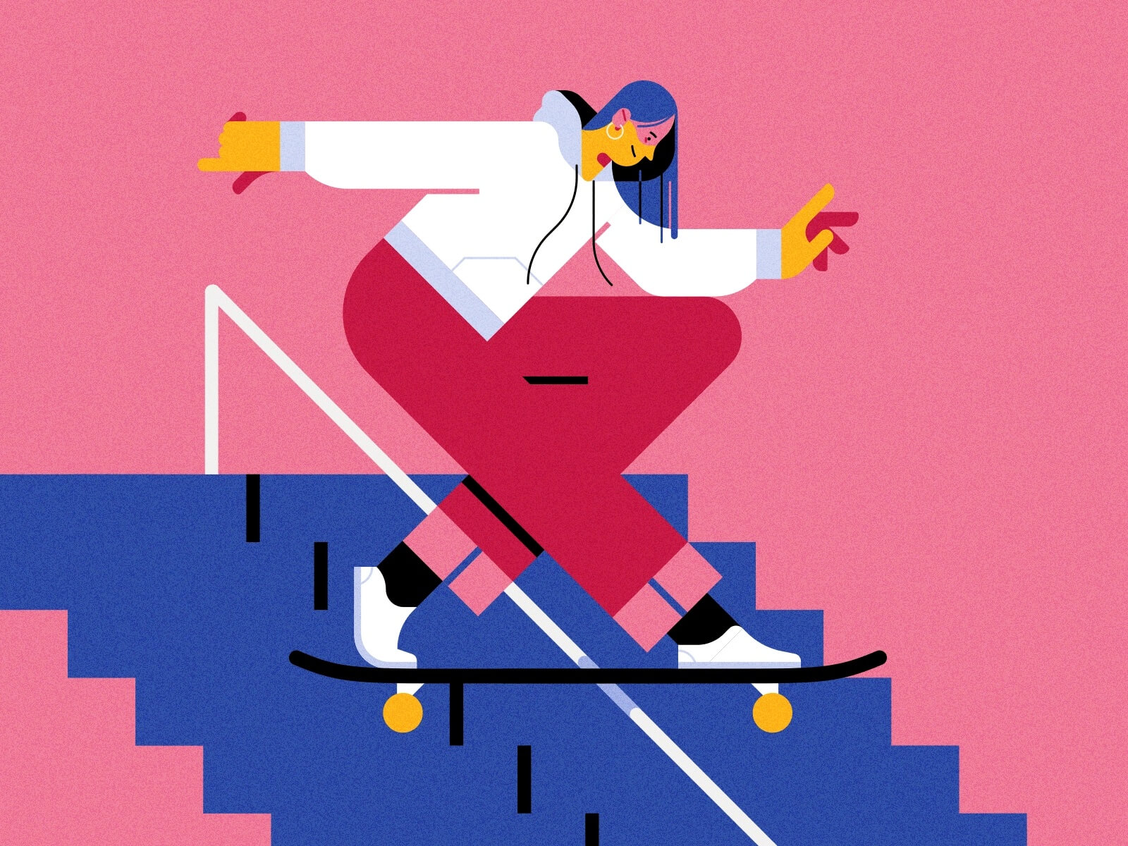
Source: dribbble.com/jusmid
Geometric Shapes
Geometry in all forms has also paved its way back into design trends. You might think to yourself that this is the first time you see geometry as a design trend, but geometry’s popularity dates way back into art history. However, today’s geometry has adapted to the needs of a modern user. Whether it is geometric shapes combined with abstract art, organic forms, or typography, in 2021, all of this is allowed, and we love it! Which one you use will, again, depend on your business goals.
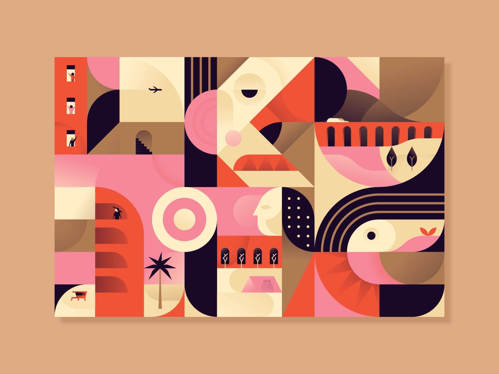
Source: dribbble.com/miguelcm
Texture and Grain
Flat design is still trendy. Correct. However, we can see that even the most contradictory designs can be popular at the same time. Every audience requires a different approach. In this case, the texture is making its way back into the game. Although flat designs give away a very clean feel, we involved some emotions and brought back some texture. Again, as with most of these trends, texture brings realness into your design. With our ongoing digital lives, it looks like this is what we all crave at the moment. Grain particularly gives the design that real-to-touch feeling and plays with the user’s mood.
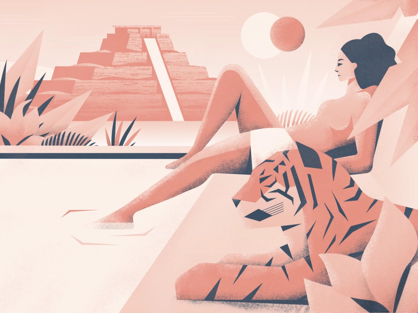
Source: dribbble.com/joshdeware
Intricate Lettering
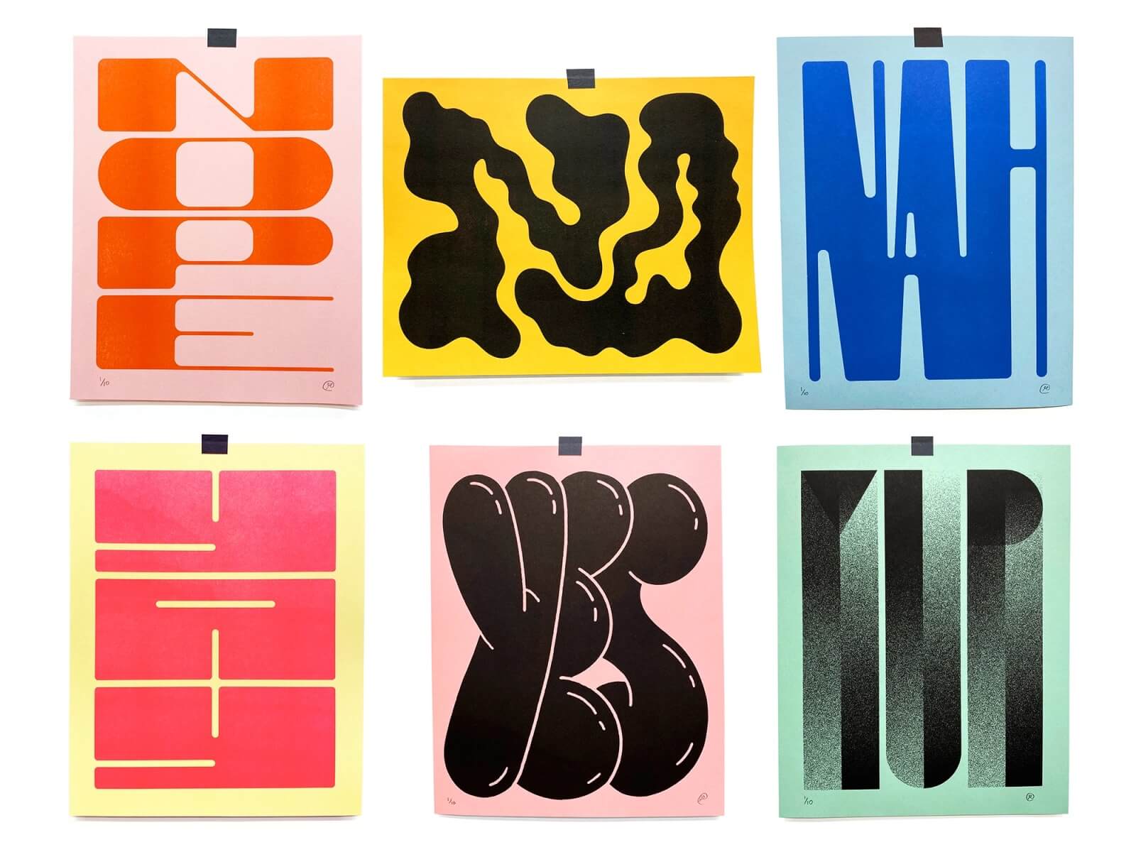
Big, bold, nostalgic, quirky, and simply intricate. That is what’s going on in typography these days. Everything! If your typography is the protagonist of your design and you’re expecting it to leave an impression on your user, it’s got to have a personality. Be bold! Like your type ;)
Source: dribbble.com/RypeArts
