Every website, app, or digital product is constructed of certain elements with a visual appearance. These are, for instance, the fonts, the lines, the shapes, the colors, etc. We can also refer to them as the building blocks of a website. Visual design principles give these building blocks meaning by defining a particular structure.
Hence, the visual design principles are a great tool for UX designers to optimize users’ experiences. The fact is that most people judge a book by its cover. When a user visits your website for the first time, they unconsciously decide whether they like what they see or not in the first few seconds. Most of the users cannot necessarily say why they like it; they just do. That’s why we have UX and UI designers, who are the ones that do know “the why” by having the knowledge of the visual design principles as well as implementing them effectively.
With quickly emerging trends, it is crucial to come back down to earth and remind ourselves of visual design fundamentals. Trends come and go, so you don’t always have to use them nor understand them, but the fundamentals were, are, and will always be here, so let’s not forget about them and get them right!
Scale
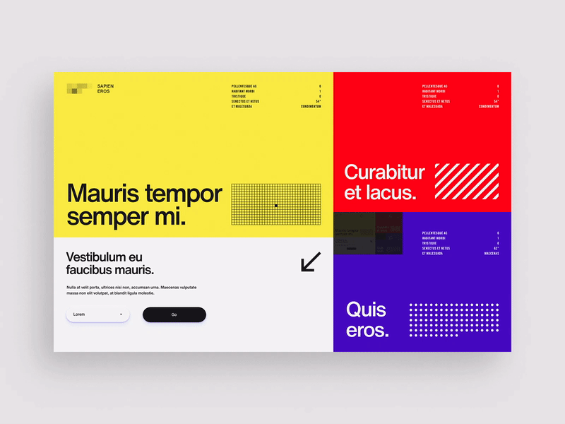
The first one on the list is scale. You’d say that it is pretty logical to make the most significant importance the biggest and make the ones that are not as important smaller. The bigger the aspect is, the quicker it catches the user’s attention. What if everything is important?!?! Well, then nothing is. The same goes for having everything the same size as nothing stands out, and your user will only be left confused. Be careful not to overdo it, though! Use three different sizes; otherwise, the point gets lost.
Source: dribbble.com/paperpillar
Contrast
Another visual design principle is contrast. More often than not, using contrast is ideal when you want to communicate that different elements belong to different categories. This way, your user instantly knows which elements correlate with each other because contrast creates an eminent distinction between them. There are many ways to incorporate contrastinto your website; color contrast is a good example. For example, you can have a black and white website with a pop of red color here and there to indicate significance. This way, you don’t have to worry about the placement of the element in red, as the contrast will do the job.
Source: dribbble.com/non-linear
Balance
You know those satisfying viral videos on social media where someone either cuts a cake perfectly, things are organized into a perfect shape, or some super weird perfection stuff is happening? It just feels so good to watch! Well, in UX, an equal distribution of elements on the right and on the left side of the screen is just that! (Well, almost;) Balance keeps things simple and organized. It also indicates that your website or your digital product has been very well thought out and encourages trust in your brand. When your website is easy to navigate, you know you’ve got the balance principle right.
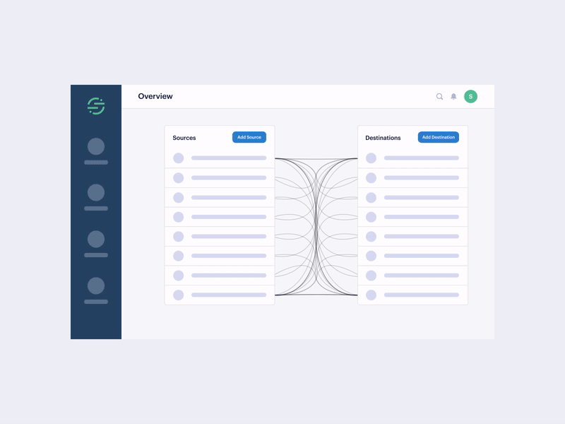
Source: dribbble.com/tonikstudio
Gestalt
The Gestalt principle was established in the 20th century by Gestalt psychologists. The principle is based on the fact that people tend to perceive scattered elements as a whole rather than each one on its own. The human brain will organize images it sees into something united that it can make sense of. For instance, in UX, it could help you decide where to place various elements when you’ve used the scale and the contrast principles already.
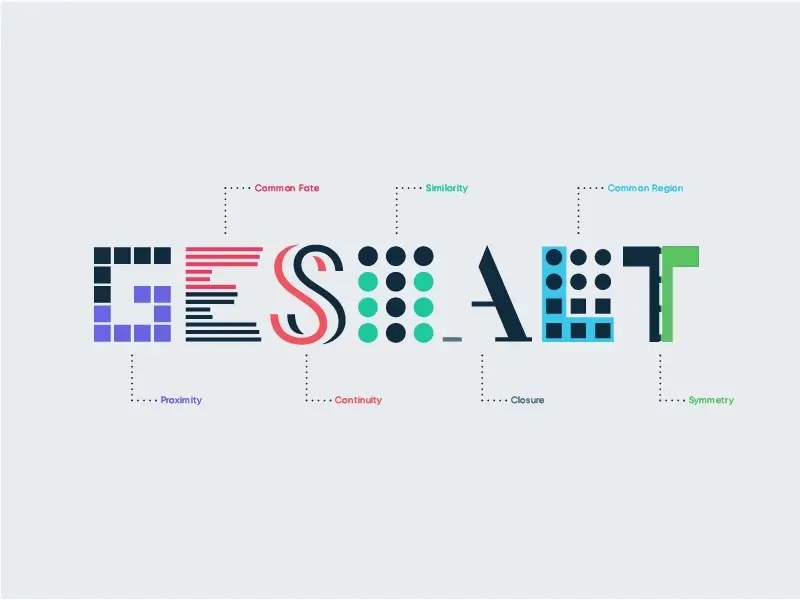
Source: dribbble.com/EleanaGkogka
Visual Hierarchy
Last but not least comes the visual hierarchy. I have left this one at the end as it pretty much applies to all of the principles above. Visual hierarchy guides the user’s eye on the page and establishes the order of importance. The user first looks at the most significant element with scale, the medium one, and finally, the smallest one. In contrast, going off the original example, the user first notices the brightest color and then wanders around the rest of the webpage. The same goes for the Gestalt principle, where spacing can direct the user’s eye. One way to know whether your visual hierarchy is on point is to determine whether your users know exactly where to look first when they land on your website and where to navigate from thereon. If they cannot, your visual hierarchy needs a bit more work. A good rule of thumb is to use a maximum of 3 different font sizes, three different typefaces, three different colors, and so on.

Source: dribbble.com/focuslab
Still don’t know why is it important to follow the visual design principles? They increase usability; hence the website is easy to use. They delight your users and incite happy emotions, and joyful emotions mean delighted users, and do you know what happy users do? They will even forgive you some minor technical defects! Lastly, following the visual design principles enhances the strength, seriousness, and reliability of your brand.