If you think that animation in UI is only a pretty add-on, think again. Animation’s purpose is far from being just a decoration. Yes, the animation is supposed to delight your users and enhance the user experience, but it shouldn’t be used just for the sake of it. Animation has become the building block for usability among UX and UI designers, specifically with its ability to delight users. This has been the case ever since motion graphics have become a more popular way of interacting with computers. Considering that animation is an essential part of UI, it is crucial to talk about its dos and don’ts. So, let’s begin with the obvious:
DON’T use animation just for the sake of it
In the first place, animation should have a purpose. Adding animation to your UI just because it looks nice will overload it with unnecessary bits. This will only confuse and overwhelm your user and will cause the opposite effect of what you were aiming for – you lose them. A functional animation could be directing the user’s attention. For instance, this could be a tiny animation to “show” your users where to look. Another example of good use of animation is for giving your users feedback. This would either assure them that they are doing what they have intended to or, on the other hand, redirect them to the right place.
Source: dribbble.com/ai
DO pay attention to the duration and speed
You’re all happy that you’ve got your animation’s purpose but hold on! The game doesn’t end there. For animation to serve the intended purpose, it has to comply with a few significant things to be great. One of them is its duration and speed. It’s been found that the optimal duration for a UI animation should be between 200 and 500ms. Click and hover animations should be on the lower spectrum of the above-mentioned duration, whereas animation spanning over a large portion of the screen or whole screen transitions will be on the higher one. Also, do not use motion blur. Just don’t. That is for animation used in different places.
Source: dribbble.com/paperpillar
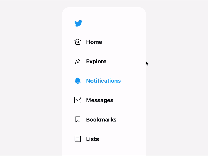
DON’T force animation on the user
Going back to the animation’s purpose. Even though you’ve justified why you want to use your animation, think about whether it could have its side effects like preventing the user from performing the task at hand or just slowing them down in general. Think about the bigger picture, which is the context where the animation will be used and not just about the animation as it is. For example, parallax scrolling makes many people dizzy. That doesn’t mean you shouldn’t use it. It all just comes down to knowing your audience.

Source: dribbble.com/outer
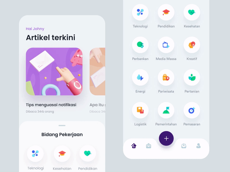
DO think about the device
Surely, your animation will look and act differently on a desktop compared to mobile. Another thing to keep in mind when designing animation is the type of screen you’re designing for; amending the animation accordingly or getting rid of it altogether. Mobile uses gestures, whereas desktop uses cursors. So, your swipe animation on mobile won’t work on a desktop. The same goes for a hover animation used on a desktop, which won’t work on mobile.
Source: dribbble.com/plat4m
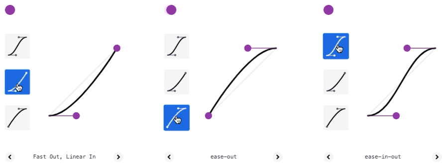
DON’T forget the easing
With easing, objects in the digital world look more natural to us and reflect the real world. This is not only appealing to the user, but it is also one of the indicators of good product design. In real life, objects don’t move in a linear fashion. Applying acceleration (ease in) and deceleration (ease out) to your animation helps your digital product mimic reality better. Exactly like objects in the real world comply with the laws of physics, so should the objects in UI.
DO keep in mind the existing mental models
People have mental models for everything. It is what they think something should look like or how it should behave based on their previous experiences and beliefs. Because of that, they expect certain things to work in specific ways. In the context of UX and UI, this essentially means that your user has a preconceived expectation about your website formed by browsing other websites on a day-to-day basis.
The purpose of animation used in UI doesn’t have to be anything complex. As we have seen, animation needs a reason to be where it is. This can be as simple as grabbing the user’s attention. Yes, you have to be careful with how you use your animations, but it would be a shame if you chose not to use any only because you were searching for a perfect justification for using them.