For some time now, data visualization has been the must-have skill instead of the nice to have the skill, as it used to be in the past. We live in an age where data is not traditional data, but it has become big data. The more data you have, the more ahead of the game you are. However, looking at mere numbers and facts doesn’t make sense to us, especially when we are presented with large quantities of data. Humans are visual creatures. For this reason, we can’t rely on statistics alone. That’s where data visualization comes in.
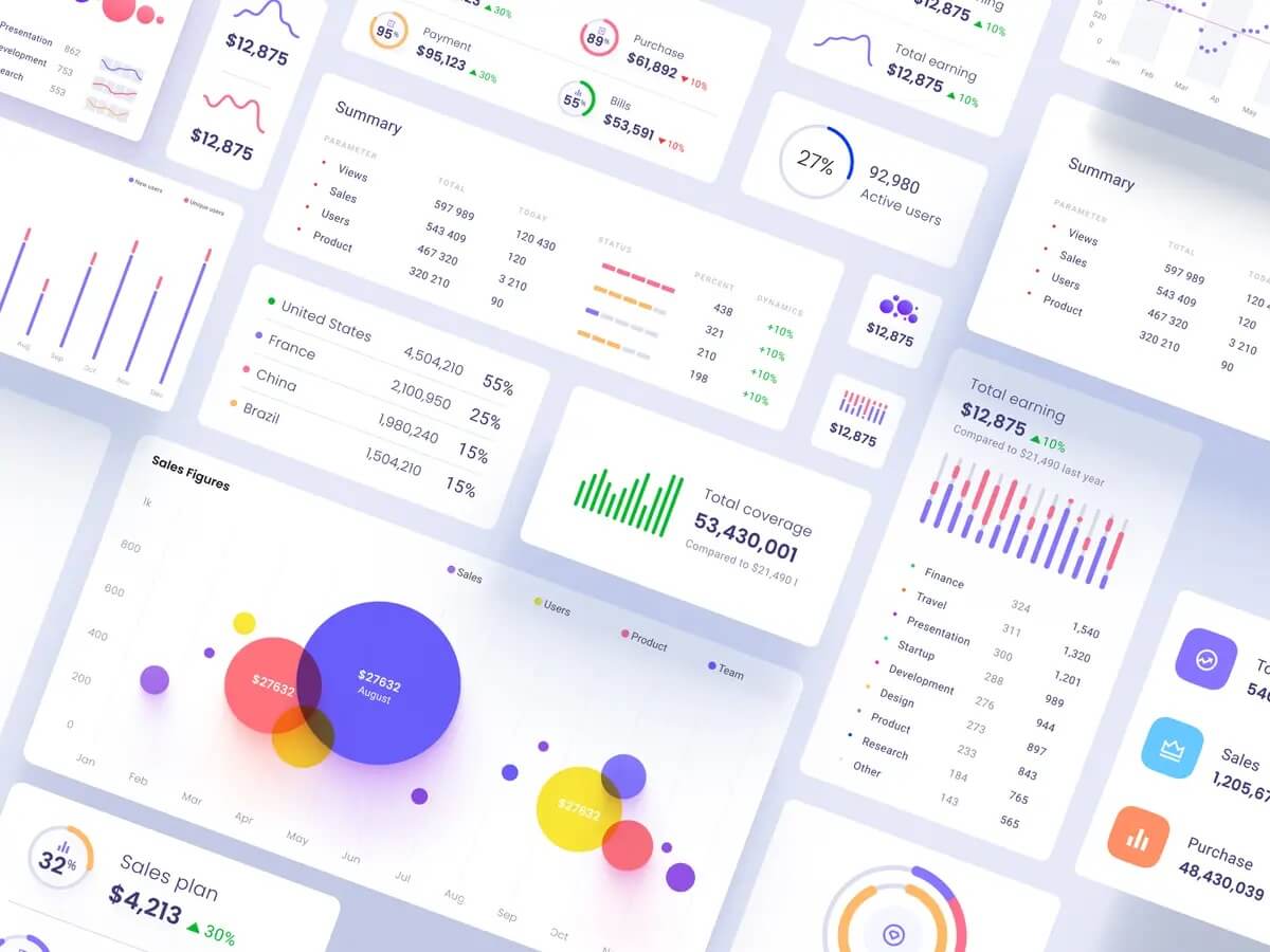
Source: dribbble.com/setproduct
What is data visualization?
In a few words, data visualization is a graphic representation of data. It communicates important information through visual mediums like graphs, charts, diagrams, maps, etc. As already mentioned, human beings are visual creatures drawn to color and patterns. For that reason, data visualization is a perfect solution to the current data overload we’re all experiencing. It is not tied to any specific field. It can be used anywhere information needs to be represented, such as sales and marketing material, annual reports, or dashboards, to name a few.
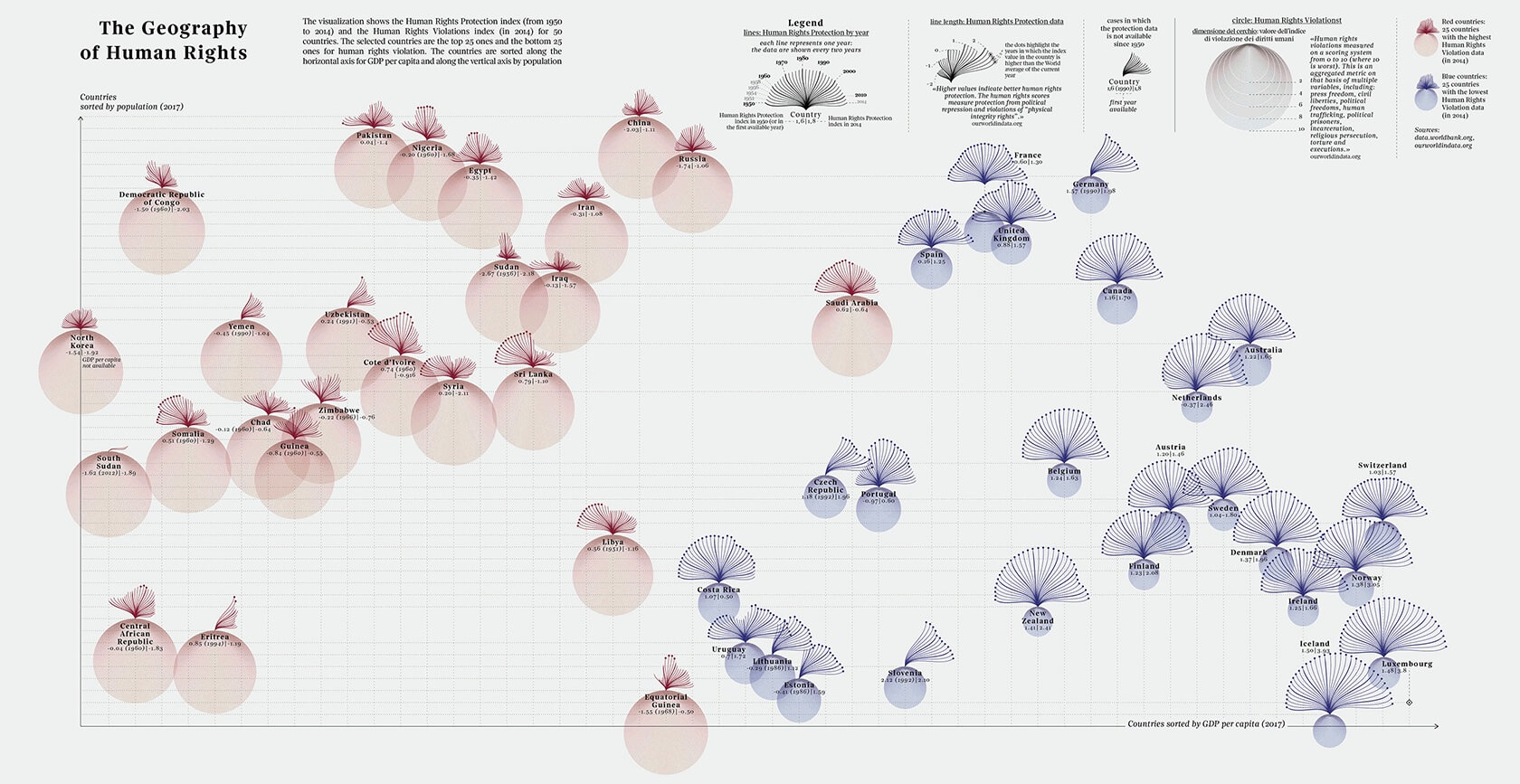
This data visualization shows the Human Rights Protection index (from 1950 to 2014) and the Human Rights Violations index (in 2014) for 50 countries. Source: Federica Fragapane
Why do we need data visualization?
Data is the new hot topic. Having a lot of data is one of the most significant assets a company can have. Having a lot of data nobody understands is as helpful as having no data at all. Understanding data is a complex but crucial thing for any business. To make the right decisions and be more productive, you need to understand the information your data is telling you. This could be any relevant information that can help your business grow. For instance, the direction the market is moving or what your customers need.
As already mentioned, data is not what it used to be. Now we are dealing with big data. This essentially means that we are faced with enormous quantities of data that are impossible to process, not to mention to make sense of. Would you be surprised if I told you that around 2.5 quintillion bytes of data are produced in the world every day (this is in 2021)? No wonder data visualization has become one of the fundamentals for any business. Data visualization allows us to identify new patterns, recognize trends, and transform what looks like chaos into useful information.
How to create effective data visualizations?
There are a lot of things to be considered when creating a data visualization that depends on the set of data you have, but answering these questions will set you on the right track:
- Who is my audience?
- What questions do they have?
- What answers am I finding for them?
The three major things to focus on when creating a data visualization are its clarity, accuracy, and efficiency. You have to make sure that your data is relevant and clear. No data visualization is going to save the day if your data isn’t credible in the first place. Secondly, the method you choose for your data visualization must be appropriate and, finally, the technique efficient.
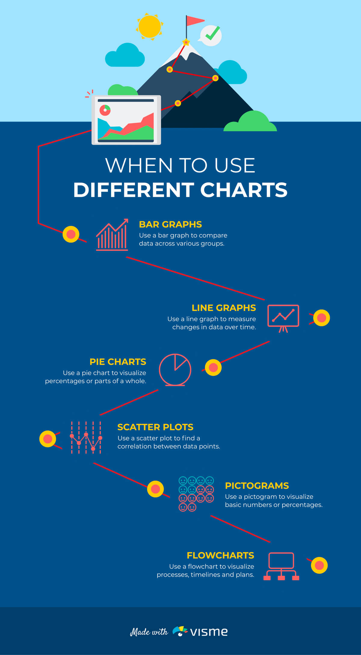
Source: visme.co
A few of many tips you can think of incorporating into your data visualization are interactivity or storytelling, for instance. Data visualizations don’t have to be static. A somewhat newer trend is an interactive data visualization where you can interact with your chart to see different information.
Data storytelling is another great way to strengthen your data visualization. Make the most of your data visualizations by creating a story around them. Data storytelling allows us to see a bigger picture, which will help your message stick, and your audience will remember the information for a longer period.
On top of that, a good story will keep your audience engaged throughout your presentation. In the context of a custom software development company, incorporating these elements can create more compelling and effective data visualizations for clients.
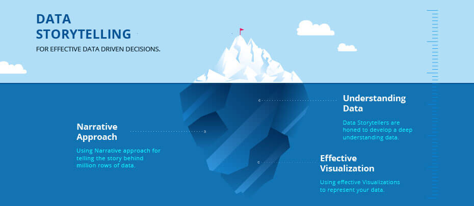
Source: infocepts.com/blog
Well, you’ve got your data, you’re clear on what you are trying to convey with them, you’ve chosen the data visualization type most suitable for your data set and even decided that you want your data visualization to be interactive; now what? What comes next are data visualization tools. The data visualization tool is software that processes the given data sets and builds the type of data visualization you have chosen. It is impossible for designers to put all that information into, let’s say, a graph themselves; thus, it makes sense to use software to make the data visualization come to life. I am not going to go into more detail about all the various data visualization tools available, but I’ve linked an article above where you can read more about it.
Mastering data visualization is a great advantage in any field that will only enhance your professional life, whether you own a business or are looking for a job.